
AquaBloom
The harmony between nature and well-being. A premium brand of waters infused with rare flowers and herbs, created to turn hydration into an experience.
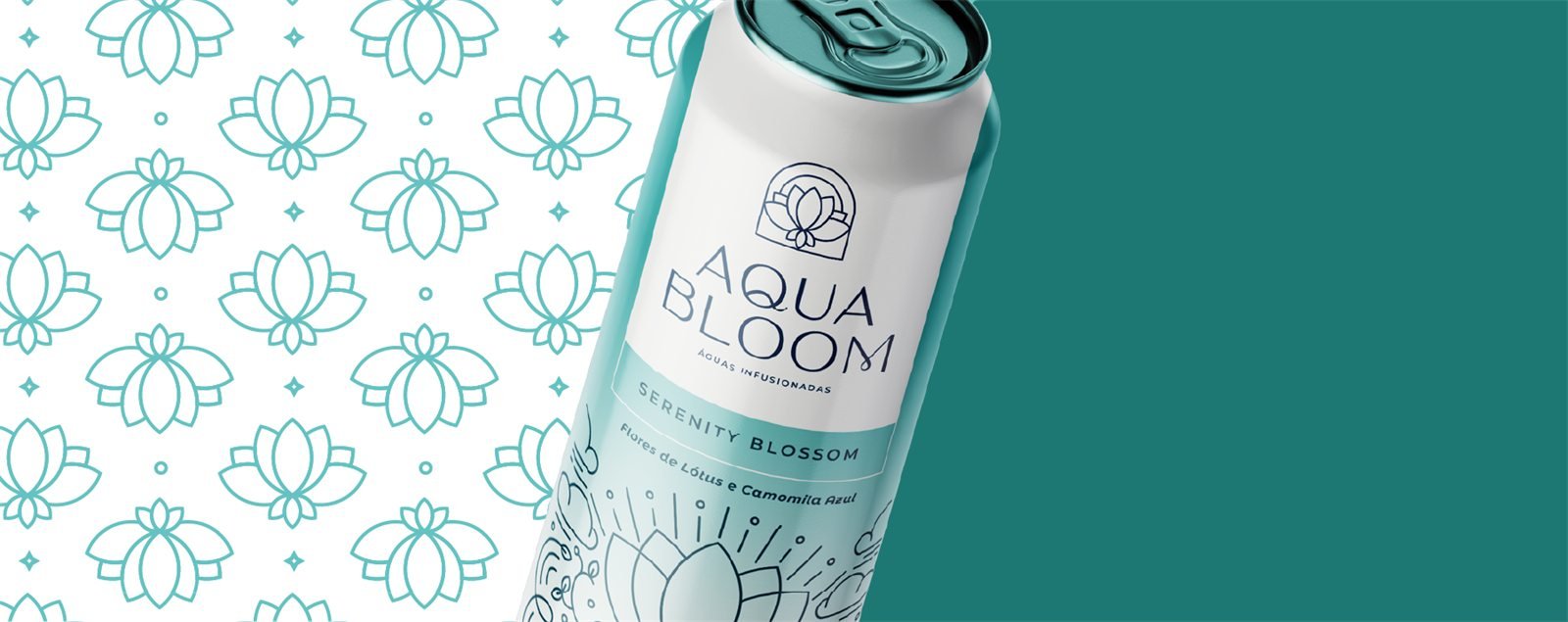
Brand context
A pause for body and mind.
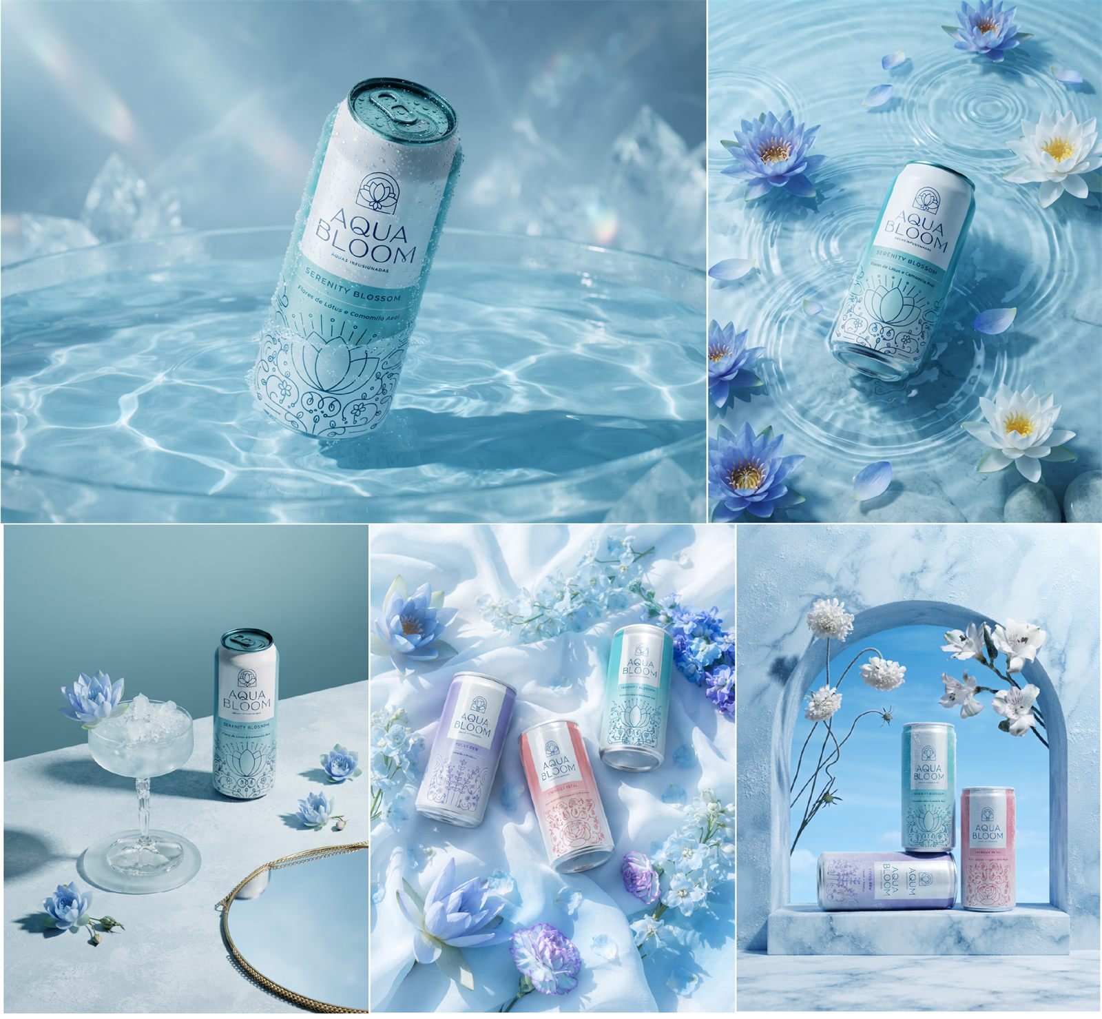
AquaBloom was created to connect people with nature in an innovative and sensory way. The proposal combines beauty, flavor and well-being in recyclable glass bottles with sophisticated design.
The brand meets different needs: relaxation, revitalization, mental clarity and an energy boost.
Branding challenge
Going beyond ordinary hydration.
The challenge was to create a brand able to occupy the premium wellness market without looking like just another flavored water. The identity had to communicate nature, sustainability, sophistication and a unique sensory experience.
Brand strategy
Four states to bloom from within.
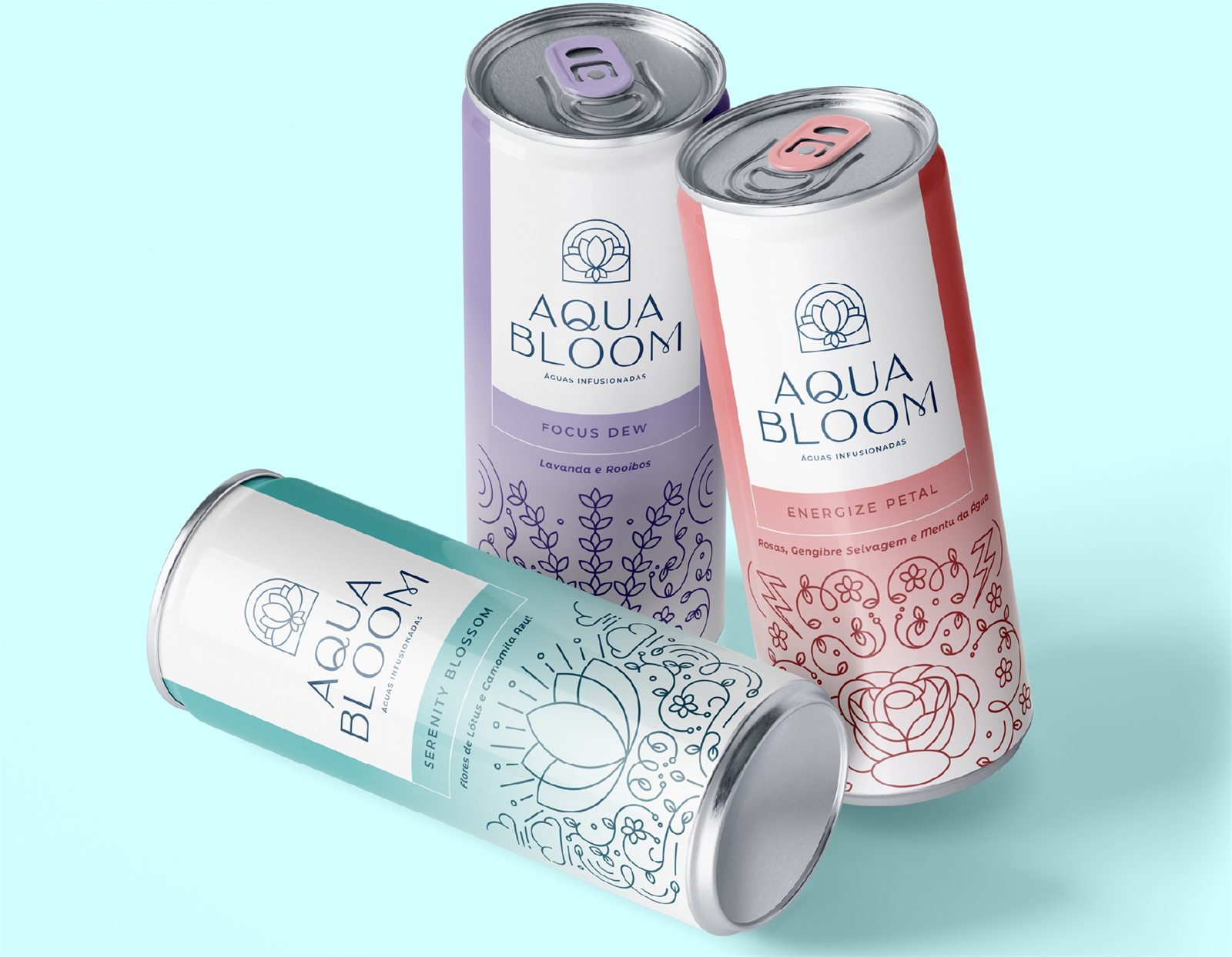
- Serenity BlossomRelaxation and inner peace.
- Energize PetalRevitalization and energy.
- Focus DewMental clarity and concentration.
- Vital BloomEnergy boost and vitality.
Visual identity
Visual identity decisions
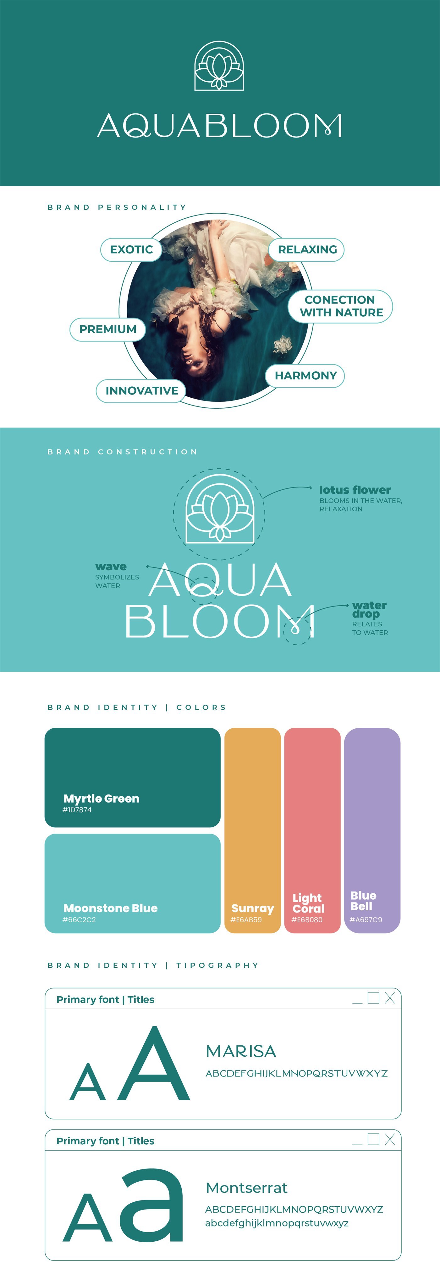
Personality
- Exotic
- Relaxing
- Connection with nature
- Premium
- Harmony
- Innovative
Brand construction
- Lotus flower: blooms in the water and evokes relaxation.
- Wave: drawn into the "Q", symbolizes water.
- Drop: in the "M", relates to water.
Colors
- Myrtle Green#1D7874
- Moonstone Blue#66C2C2
- Sunray#E6AB59
- Light Coral#E68080
- Blue Bell#A697C9
Typography
- Titles: Marisa
- Text: Montserrat
Deliverables
Deliverables and applications
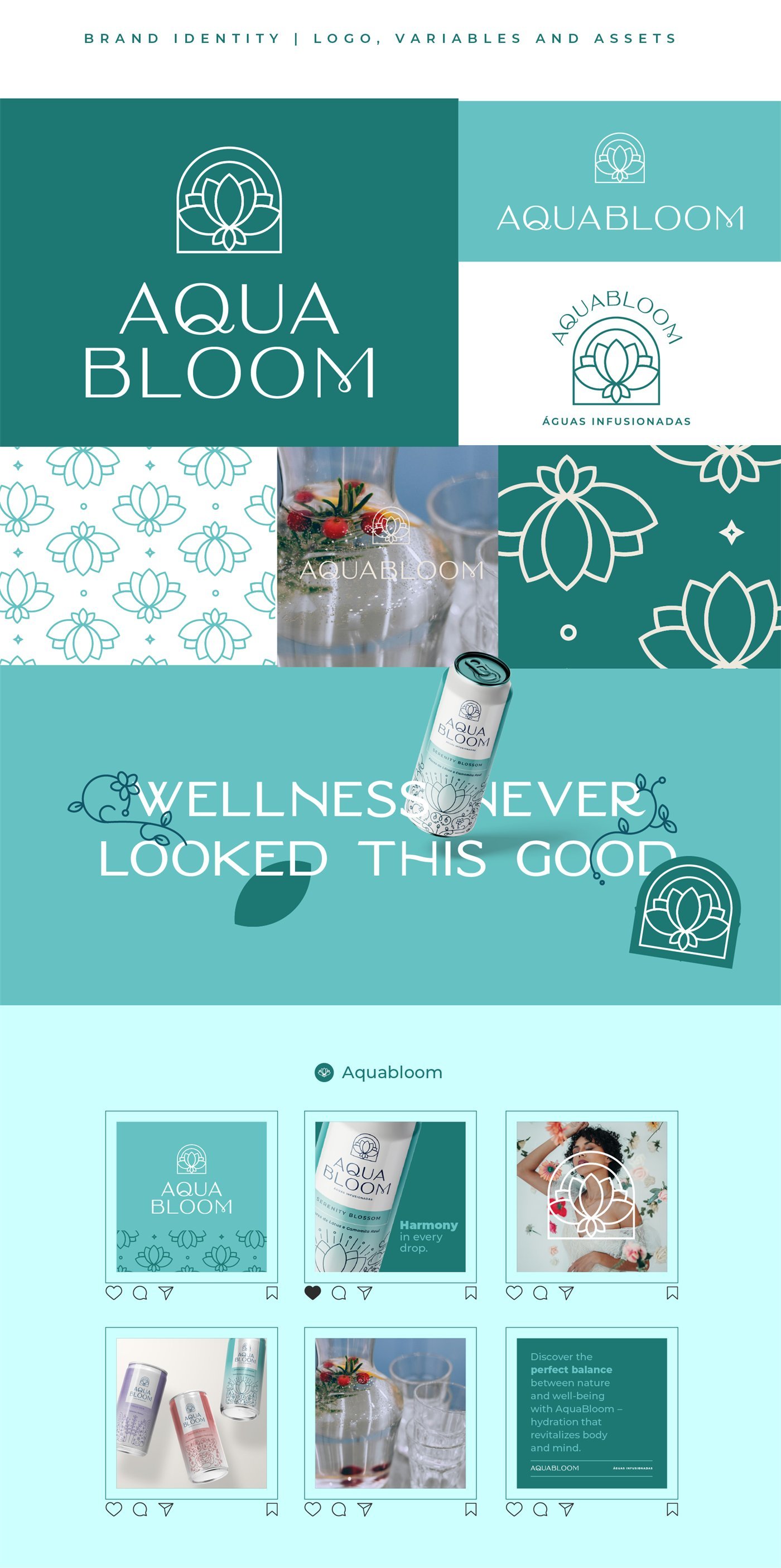
- Logo with a lotus symbol inside an arch and alternative versions (vertical, horizontal and seal)
- Graphic pattern of lotus flowers
- Color palette by flavor and typographic system
- Packaging for the four flavors, with original botanical illustration
- Stationery: letterhead, business card, notebook and mug
- Instagram pieces and product photography direction
Images
The project in images

Keep exploring
Every Fiorare project follows the Florescer method. See also the brand creation packages.