
Simples Aventuras
Simplicity in every adventure. A clean inflatables brand that becomes part of the decor and turns fun into an experience.
Brand context
When playing can also be beautiful.
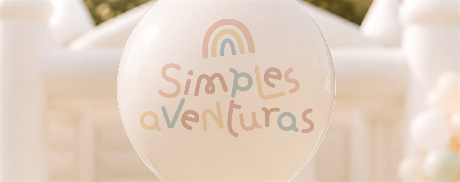
Simples Aventuras was born to change the way we see inflatables at parties and events. Instead of competing with the decor, they become part of it.
The project serves children’s parties, weddings, birthdays, corporate events and celebrations that value aesthetics and entertainment.
Branding challenge
Balancing playful and sophisticated.
The challenge was to translate the world of childhood into an identity that also speaks to elegant events, without falling into a childish, saturated or generic aesthetic.
Brand strategy
Fun with lightness, style and safety.
- Clean lookInflatables that elevate the decor.
- Close serviceA hassle-free experience.
- ExclusivityCustomization to create memorable moments.
Visual expression
A contemporary and welcoming identity.
Visual identity
Visual identity decisions
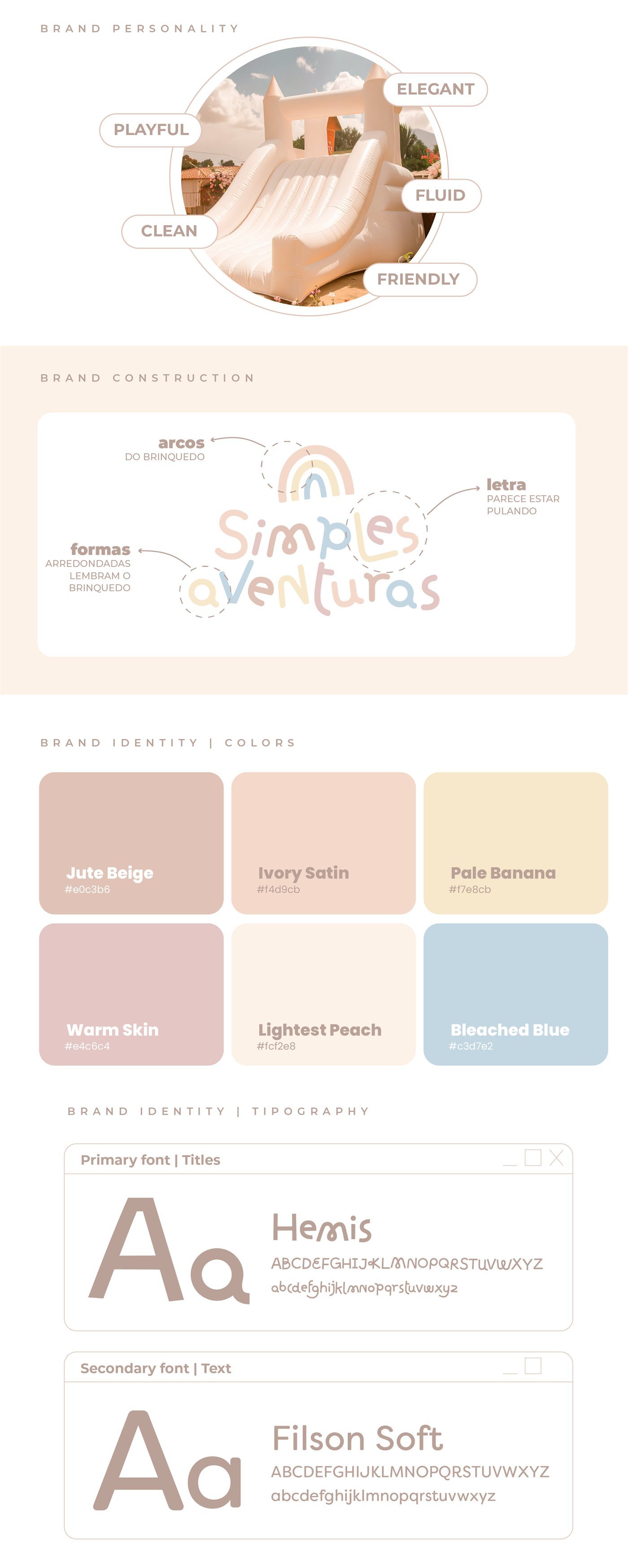
Personality
- Playful
- Elegant
- Fluid
- Clean
- Friendly
Brand construction
- Arches: recall the arches of the inflatable.
- Rounded shapes: echo the shape of the inflatable.
- Lettering: drawn to look like it is jumping.
Colors
- Jute Beige#E0C3B6
- Ivory Satin#F4D9CB
- Pale Banana#F7E8CB
- Warm Skin#E4C6C4
- Lightest Peach#FCF2E8
- Bleached Blue#C3D7E2
Typography
- Titles: Hemis
- Text: Filson Soft
Deliverables
Deliverables and applications
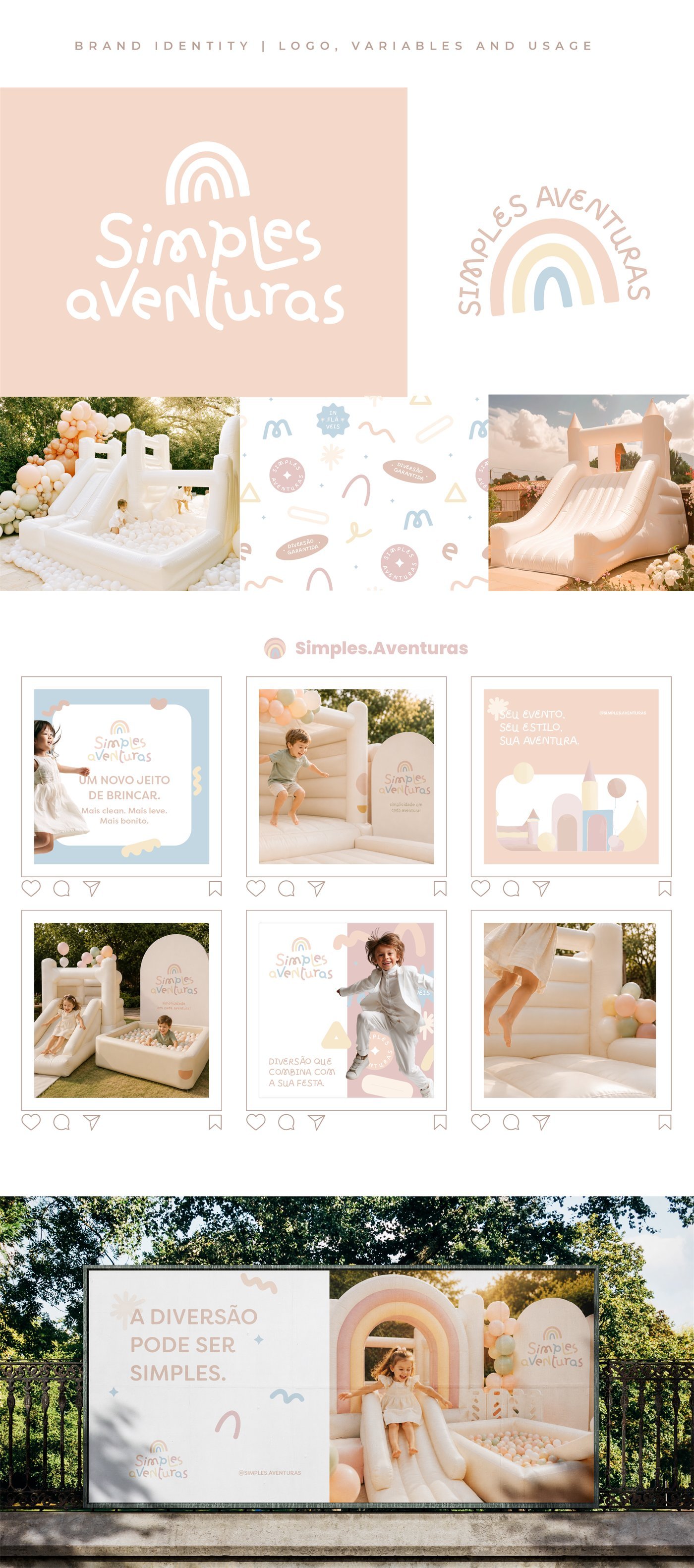
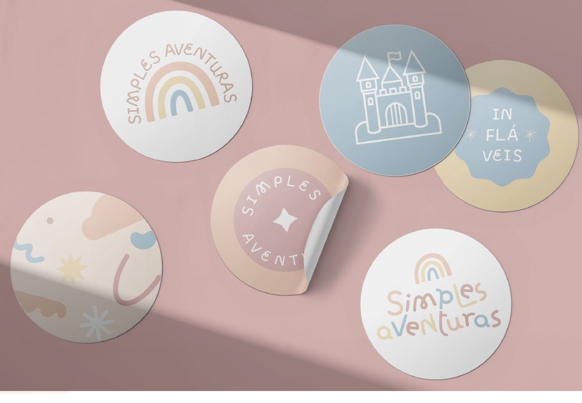
- Logo in two versions: with a rainbow and as a circular seal
- Graphic pattern with loose shapes, seals and illustrations
- Pastel palette and typographic system
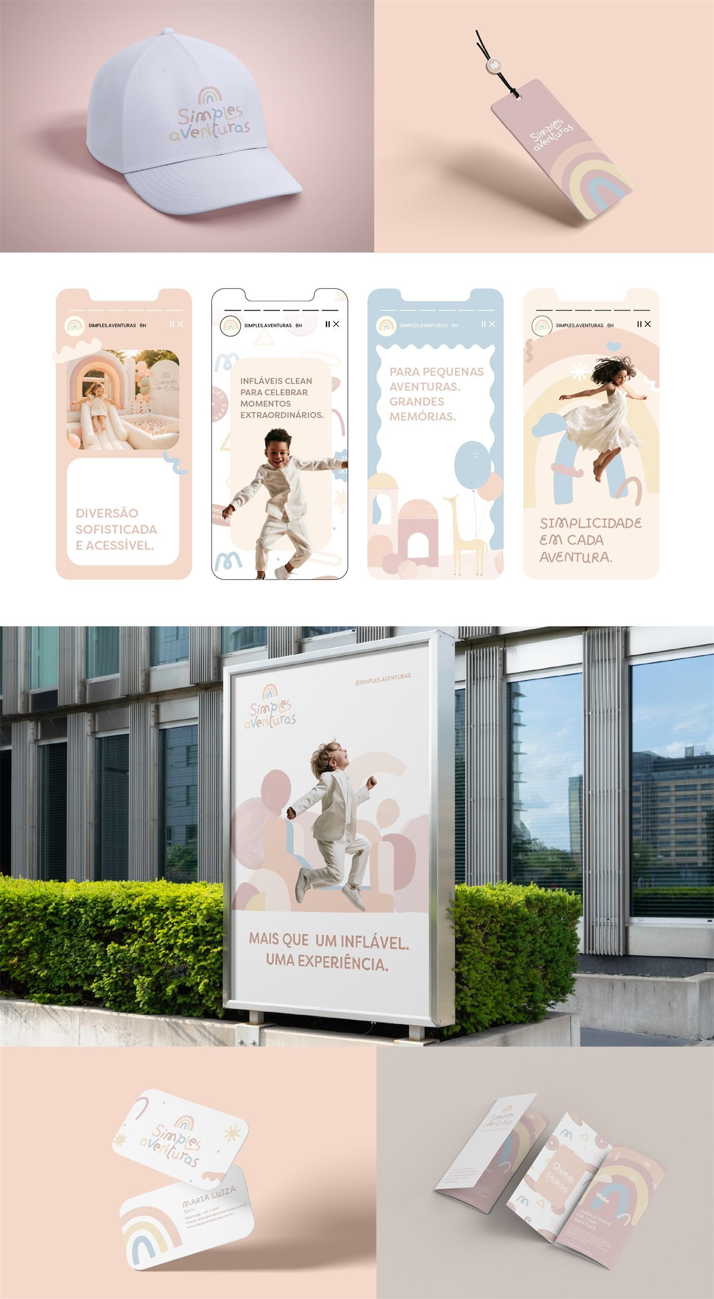
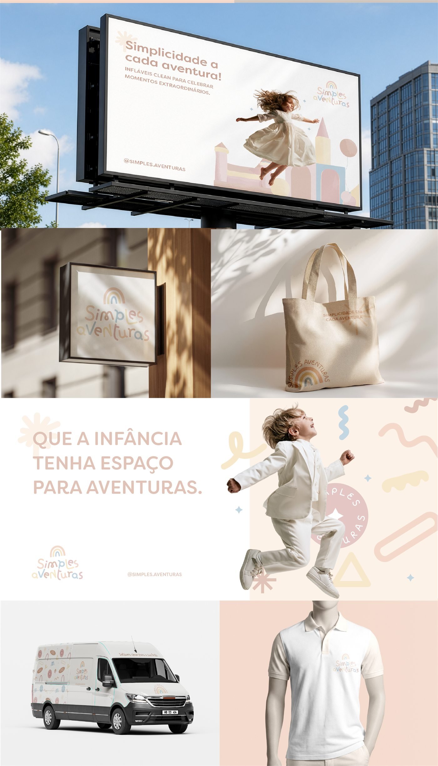
- Communication pieces: posts, stories, poster and billboard
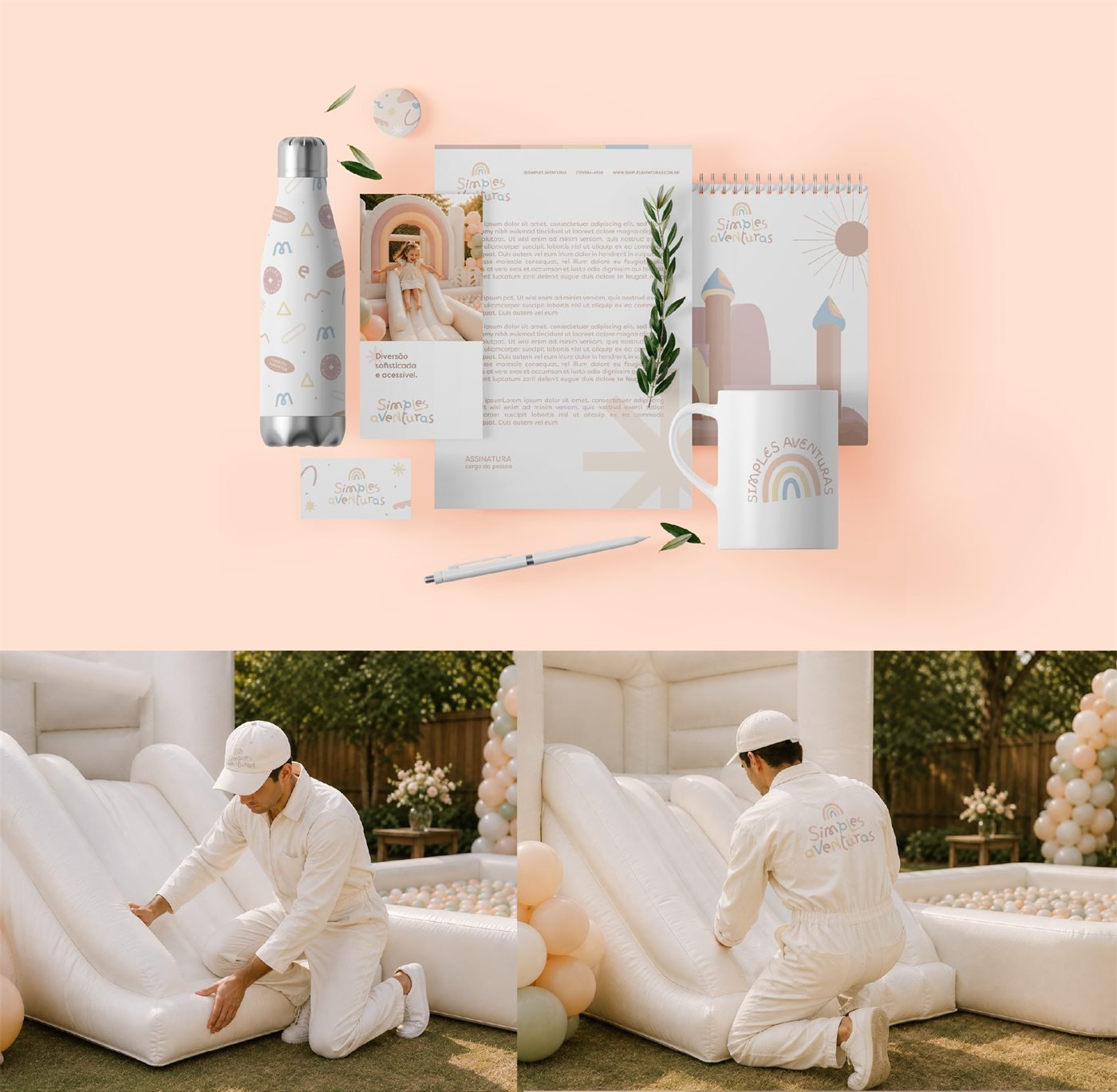
- Applications: storefront sign, tote bag, van, uniforms, cap, tag and stickers
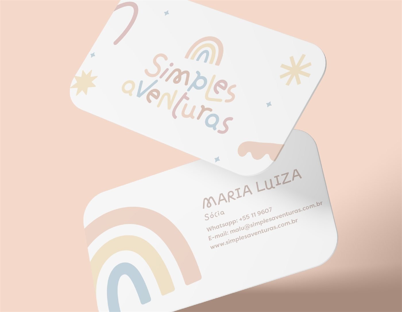
- Stationery, business card, bottle and mug
Images
The project in images
Keep exploring
Every Fiorare project follows the Florescer method. See also the brand creation packages.