
Solenne Skin Care
A care ritual for after the sun. A premium brand that balances nature, sophistication, science and sensoriality.
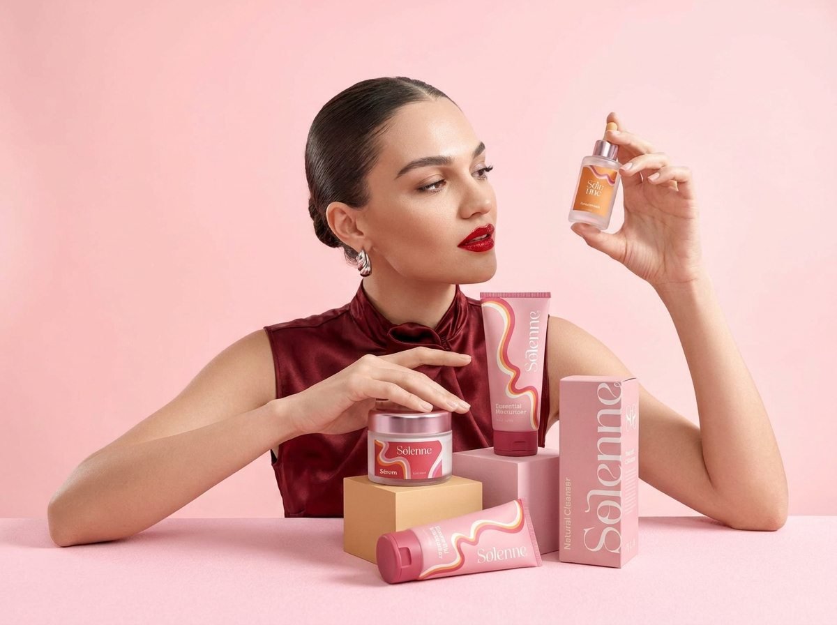
Brand context
Care does not end when the beach day does.
Solenne was born from the realization that skin needs attention after sun exposure. The proposal was to turn that need into a pleasurable self-care ritual.
This conceptual branding project built the brand from scratch: from language to visual system.
Branding challenge
Escaping the obvious after-sun codes.
It was important to create desire and sophistication without looking like just another sunscreen or summer cosmetics brand.
Brand strategy
Sun. Nature. Ritual.
- SunThe origin of the experience.
- NatureIngredients and sensoriality.
- RitualPause, recovery and reconnection.
Visual expression
An identity that turns care into desire.
Visual identity
Visual identity decisions
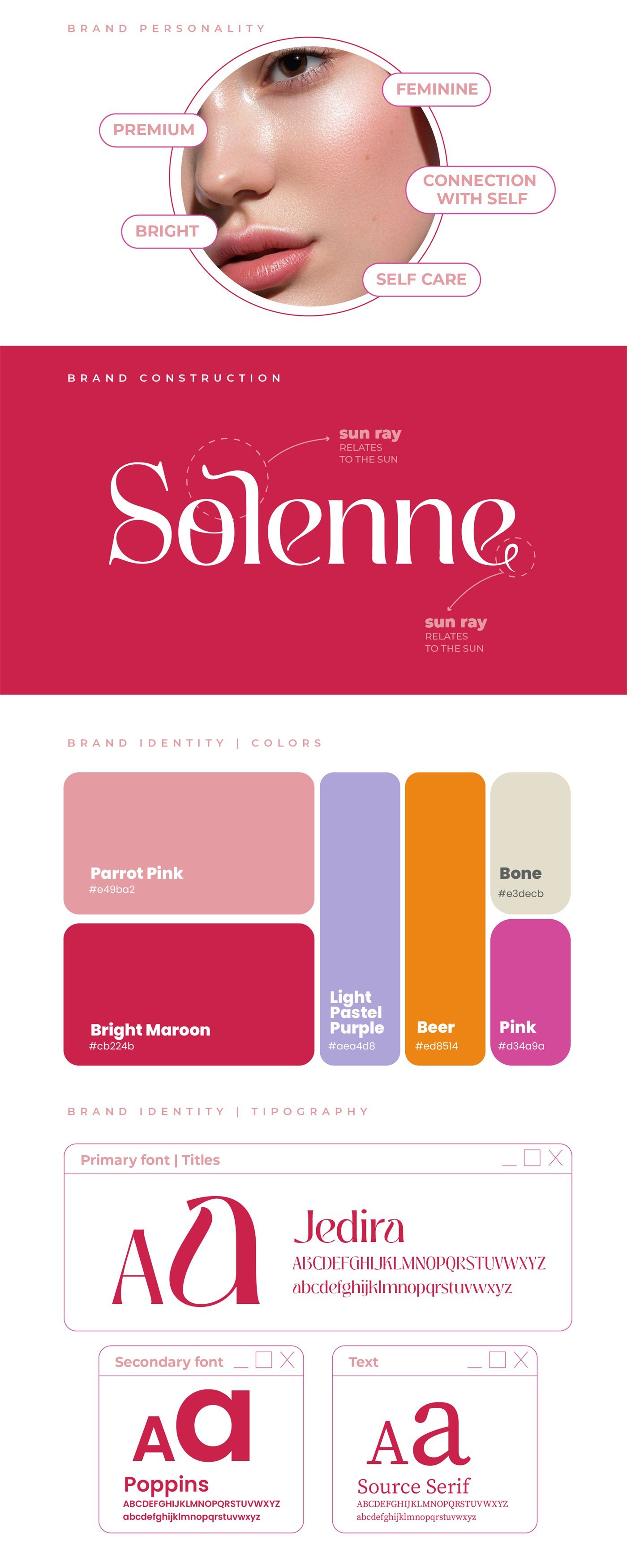
Personality
- Feminine
- Premium
- Bright
- Connection with self
- Self-care
Brand construction
- Sun rays: drawn into the "o" and the final "e" of the logo, relate to the sun.
- Monogram: a compact version of the name for packaging and profiles.
Colors
- Parrot Pink#E49BA2
- Bright Maroon#CB224B
- Light Pastel Purple#AEA4D8
- Beer#ED8514
- Bone#E3DECB
- Pink#D34A9A
Typography
- Titles: Jedira
- Secondary: Poppins
- Text: Source Serif
Deliverables
Deliverables and applications
- Logo, monogram and graphic pattern
- Color palette and three-font typographic system
- Packaging: tube, jar, dropper, bottles and boxes
- Shopping bag, gift box and stationery
- Instagram pieces and mobile online store mockups
- Product photography direction
Images
The project in images
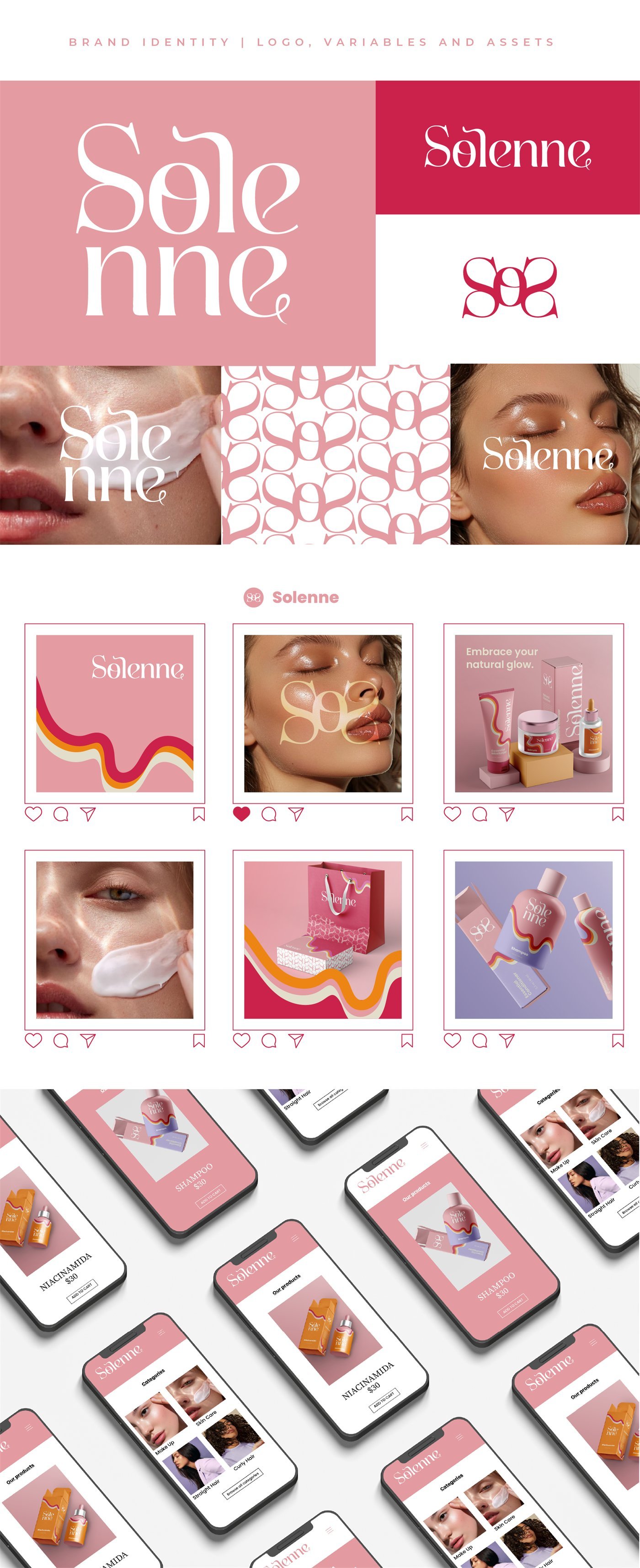
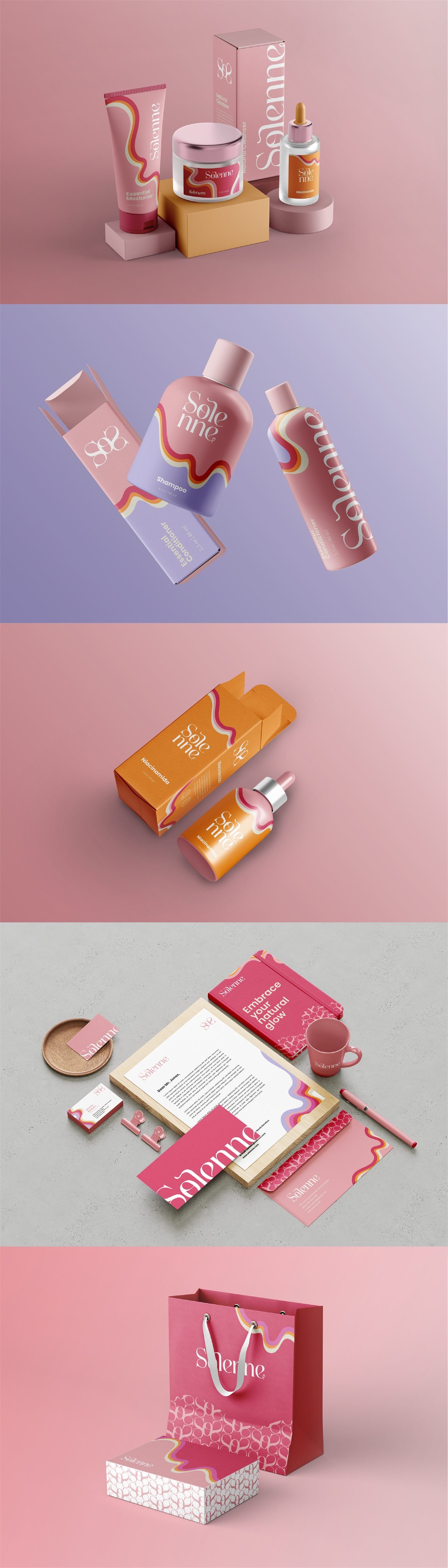
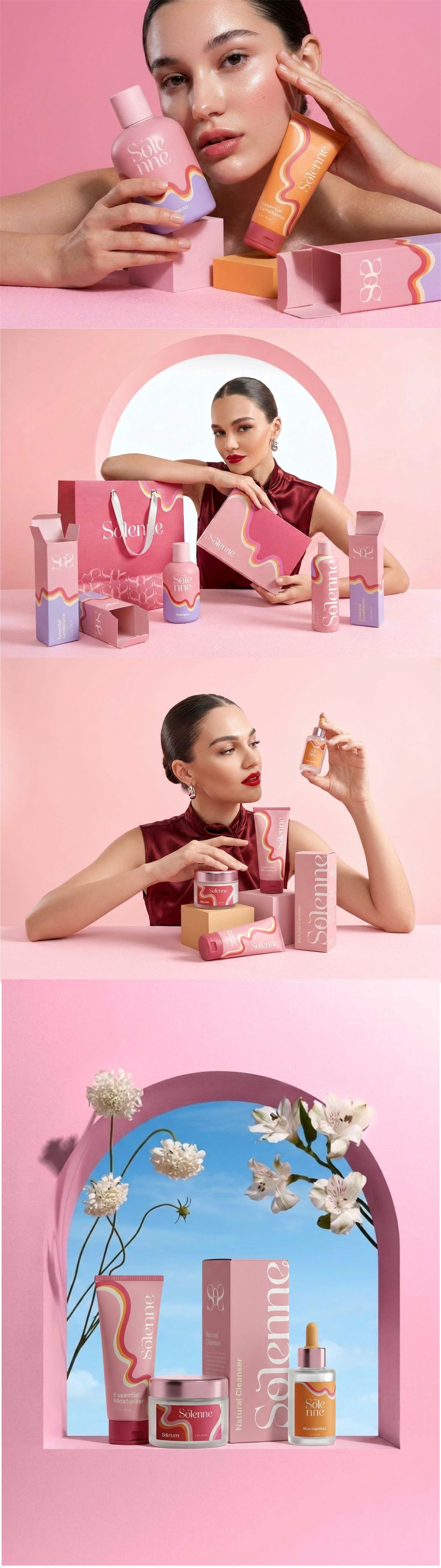
This is a conceptual project.
Keep exploring
Every Fiorare project follows the Florescer method. See also the brand creation packages.